Bien Dire is a personal astrology brand created by Bénédicte.
She wanted to:
Modernise her visual identity
Make her universe more joyful and distinctive
Structure her Instagram communication
Develop a consistent website
Designing a scalable visual identity and digital ecosystem for a growing astrology brand.
Bien Dire is a personal astrology brand created by Bénédicte.
She wanted to:
Modernise her visual identity
Make her universe more joyful and distinctive
Structure her Instagram communication
Develop a consistent website
Before the project:
Unstructured visual identity
Lack of consistency across communication materials
Difficulty translating content into visual formats
No reusable design system
Create a visual system that is both expressive and structured.
Design an identifiable and scalable visual universe while preserving the unique personality of the project.
Art direction
Illustration
Visual system design
Canva template creation
Web design
Brand asset structuring
The visual universe revolves around the heron, a totem animal symbolising transformation and the balance between earth and sky.
A symbol of renewal.
Thoth, the first god of astrology in ancient Egypt, was represented as an ibis — a wading bird.
His partner, Seshat, later became the “official” goddess of astrologers, architects… and librarians.
The Bien Dire colour palette is built around a soft, luminous and approachable universe, echoing the philosophy of humanistic astrology.
Each colour was chosen to extend the poetic spirit of the project: blue evokes the clarity of the sky, yellow recalls the warmth of the sun, while pastel tones create a gentle, benevolent atmosphere, reflecting Bénédicte’s energy.
The Bien Dire typographic system balances symbolic elegance with modern readability.
It reflects the project’s dual nature: both spiritual and accessible, grounded in softness and clarity.
Cinzel – used for main headings (H1–H2)
→ Its classical style and refined capitals evoke the astrological universe and the symbolic dimension of the project.
Arimo – used for subheadings and section titles (H3–H4)
→ More neutral and contemporary, it brings a professional tone and smooth reading rhythm.
Source Sans Pro – used for body text and paragraphs
→ Modern, clear and highly readable, reinforcing the accessible and welcoming tone of the brand.
The main blue used for the “BIEN DIRE” text (#4A97C4) evokes serenity, the sky, and mental clarity.
The dark blue of the circle behind the heron (#1A2740) recalls the night sky and the depth of the astrological universe.
The grey used for the heron’s body (#C9C9C9) brings neutral balance and visual sobriety.
The orange of the beak (#F49C64) acts as a solar accent, adding warmth and vitality.
The typography expresses both the clarity of the message (“Dire”) and the benevolence of the guidance (“Bien”). It contributes to a visual identity that feels luminous, accessible, and professional.
The Bien Dire logotype was designed as the central element of the brand’s visual identity. It reflects the project’s core values: balance, transformation, and benevolence. Each variation—from the main logo to the simplified pictogram—preserves the distinctive elements of the heron symbol.
These graphic elements accompany the visuals on the website and social media, helping to create a bright, cohesive atmosphere.
The heron is a central symbol, which I adapted into several variations to suit different applications.
Most of the graphic elements are handcrafted illustrations, created specifically for the project.
The website had issues with readability, visual consistency, and mobile optimisation.
Issues
Services are not clearly visible on the first screen
Navigation not very intuitive
Booking access is not direct enough
Improvements
Place services at the centre of the experience
Simplify the navigation
Clarify the content hierarchy
Issues
Interactions not adapted for touch
Insufficient readability
Unclear mobile hero section
Improvements
Adapt interactions for touch use
Optimise margins and typography
Clarify the mobile content hierarchy
Issues
Colour palette not harmonised
Lack of consistency between pages
Absence of a clear graphic system
Improvements
Deploy a coherent colour palette
Integrate distinctive brand elements
Establish a reusable visual language
Issues
Technical dependency
Inflexible structure
Improvements
Rebuild using WordPress + Elementor
Migration and system stabilisation
Creation of reusable and scalable blocks
The design system structures the visual universe of Bien Dire. It ensures consistency, readability, and reusability across all communication materials.
Foundation
A pastel palette inspired by astrology and natural light.
Hierarchised colours (primary, accents, neutrals)
Visual balance and consistency across all materials
Structure
A heading system from H1 to H4 structures the information.
Clear visual guidance for the reader
Enhanced readability across all materials
Components
Illustrations integrated as elements of the system
Cards and sections designed as reusable modules
Seamless adaptation across web, social media, and print
Structure
A modular grid ensuring alignment and consistency
A horizontal rhythm based on regular columns
A system adaptable for both desktop and mobile
A system of reusable modular cards
Standardised buttons and CTAs
Sections designed as scalable patterns
1. Faithful implementation of the mockups using WordPress with the Kadence theme and Elementor.
2. Responsive management – Manual optimisation: removal of overly busy backgrounds, simplification of columns on mobile displays, systematic centring of CTAs, and reduction of illustration file sizes.
3. Dynamic content integration — Implementation of the Services pages with direct links to Calendly; Instagram feed not integrated (client account not accessible).
4. Security and performance — Automatic backups via UpdraftPlus, image compression, and removal of unnecessary CSS.
The final Bien Dire website offers a soft, poetic, and modern experience, perfectly aligned with Bénédicte’s sensibility.
The homepage presents the essential information very clearly: services, client presentation, testimonials, and the Instagram feed.
The navigation is designed to be smooth and intuitive, with direct access to appointments through Calendly links.
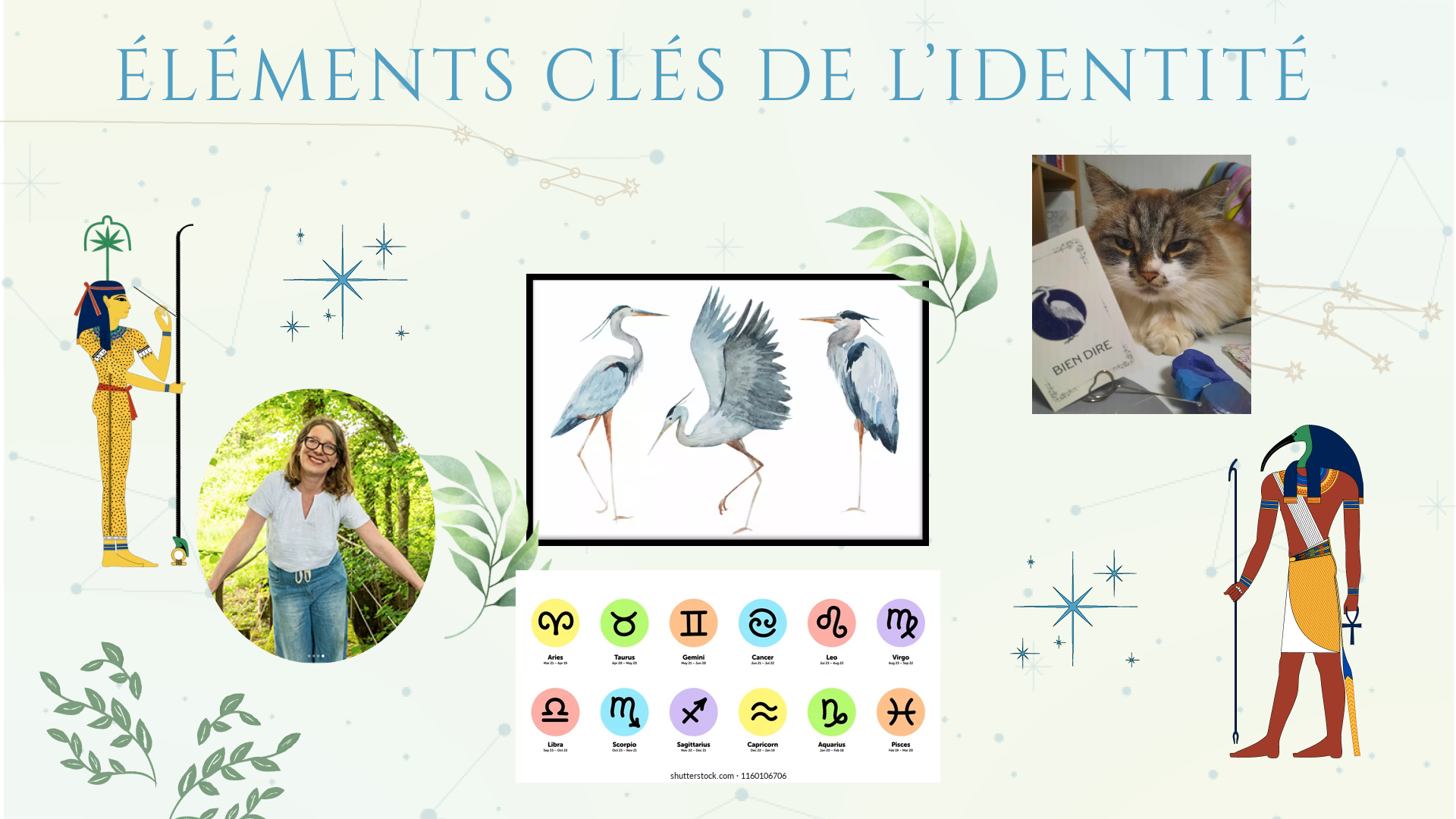
In Egyptian mythology, Thoth—the god of writing, knowledge, and cosmic order—is represented as an ibis, a wading bird closely related to the heron.
Seshat, the goddess of writing, knowledge, and architecture, is his female counterpart. Both are associated with the origins of astrology and the transmission of knowledge.
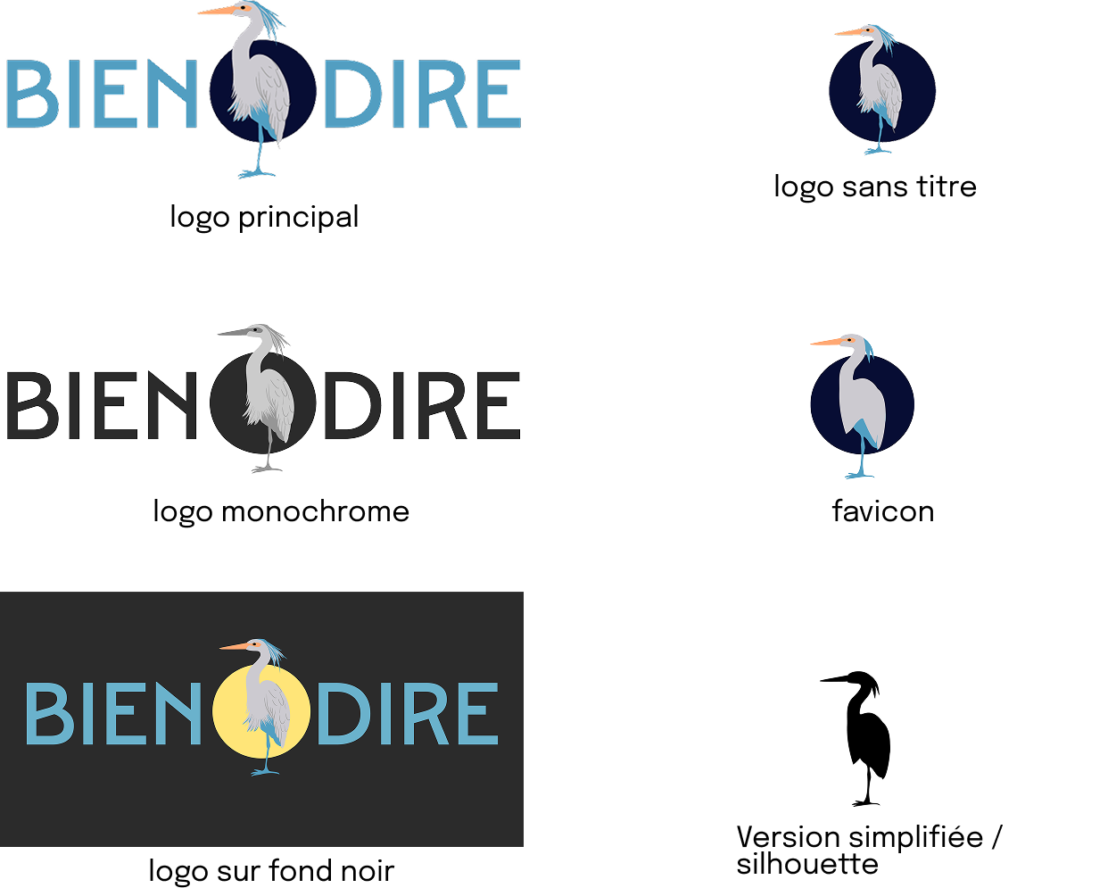
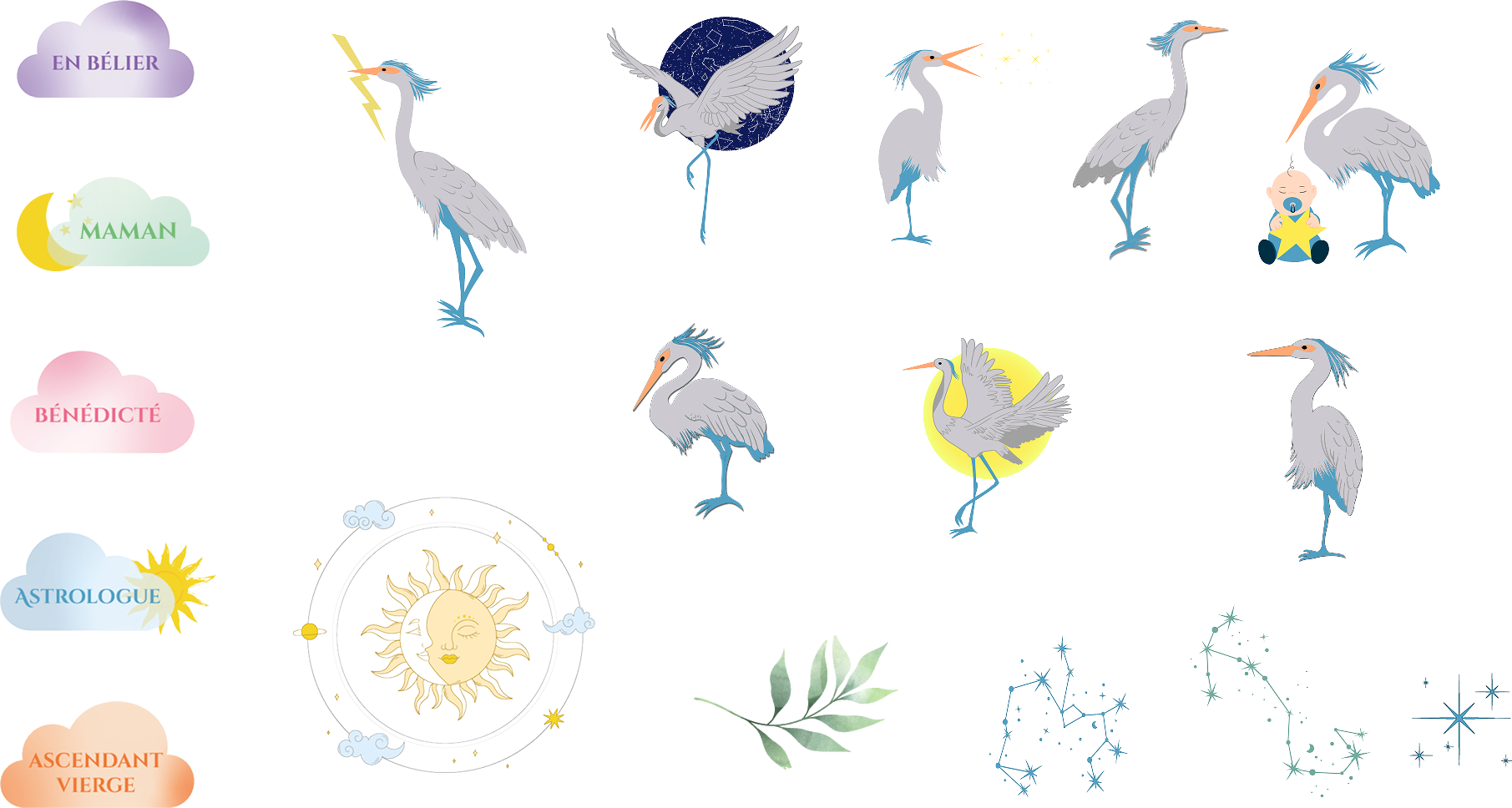
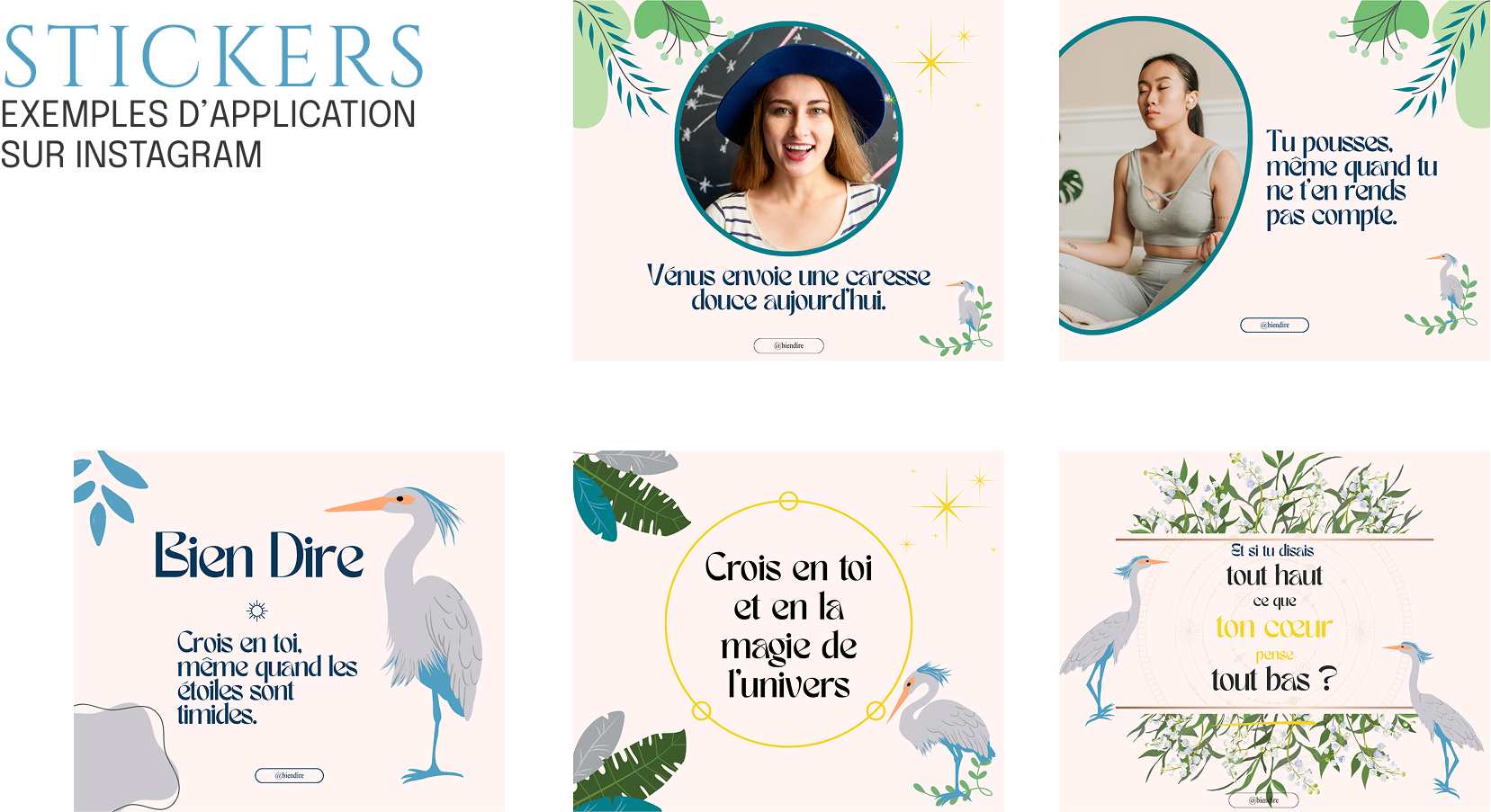
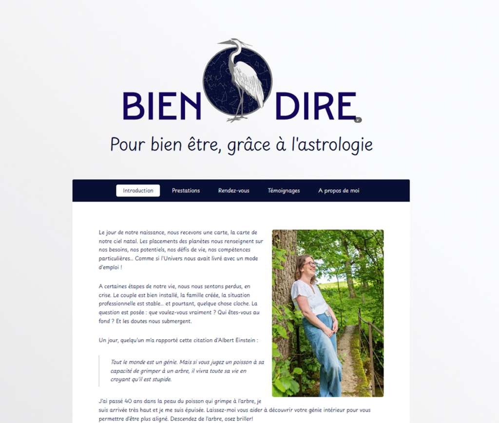
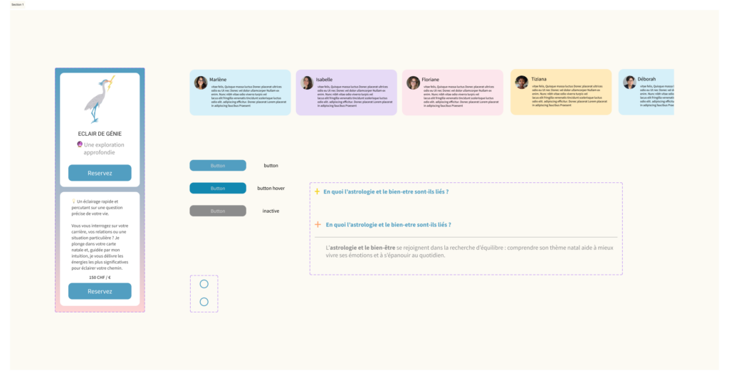
The heron has long served as Bénédicte’s totem animal. She sees it as the local reflection of the sacred ibis, a symbol of knowledge and guidance.
This symbolism perfectly reflects her philosophy:
“Supporting people in their inner transformation, with gentleness and clarity.”
This storyboard was created partly on my knees and partly using a table at GRETA.
Thoth appears writing on his scroll, a symbol of knowledge and clarity.
Seshat enters the frame and gently touches him with her staff, triggering the transformation.
The metamorphosis begins, and the entire character gradually turns into a heron.
The wings then unfold, and the heron takes flight.
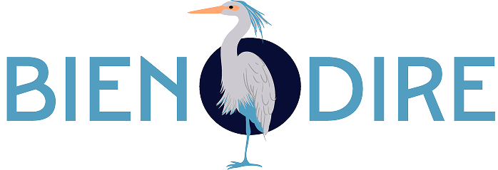
The video concludes with the animated appearance of the “Bien Dire” logo.