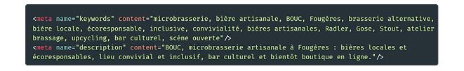
As part of my training, I worked on the creation of the complete brand identity for an independent craft microbrewery based in Fougères.
Boom Bouc is a project led by Steve Bennett, a passionate brewer of Irish origin, based in Brittany for several years, with the ambition of creating a local brewery with a strong and distinctive character.
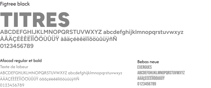
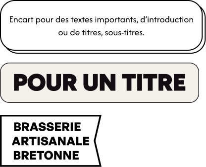
The goal was to design a strong, recognizable and lasting visual identity, capable of expressing both the project’s artisanal nature, its personality and its local roots.
The work covered all the brand’s foundations — from naming to visual identity, including both print and digital communication materials.
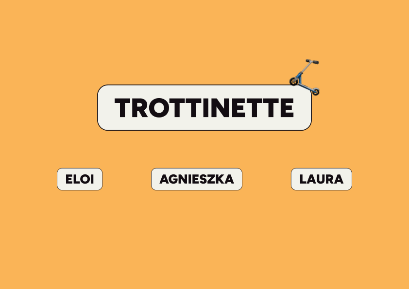
This project was carried out collaboratively within a team of three: Laura Bruneau, Eloi Filaudeau and myself.
My role in the project:
Logo design
Creation of visual identity elements
Flyer design
Production of a video for social media
To create the logo, we were given complete creative freedom, which allowed the three of us to explore different directions.
We deliberately chose not to define the name before designing the logo, in order to avoid steering our creativity in the same direction.
Here are the three moodboards created at the very beginning of the project.
The client’s final choice led us to validate the name of the microbrewery and to design the different logo variations.
Bouc therefore became the brand name, referencing the chèvre des fossés, a species native to northwestern France (including Brittany), and also because of the word’s strong, striking impact.
As the visual identity is highly expressive, it was important to define clear limits, especially in terms of typography.
While each beer has its own visual personality and typeface, the global brand identity relies on a consistent typographic system, limited to a maximum of three fonts.
As with typography, colour usage is intentionally restrained within the overall visual identity.
We selected fresh, lively colours designed to work together across the brand’s various materials, while leaving room for flexibility when necessary.
To complement the visual identity, we developed a simple brutalist graphic line that helps structure the brand’s visual elements, such as text containers and image frames.
As part of the creation of the visuals for the three products offered by our client, the logo needed to be adapted to match different visual atmospheres.
As mentioned above, the brewery offers three distinct beers — a Radler, a Gose and a Stout — which required maintaining overall brand consistency while allowing each product to express its own identity.
We deliberately chose to develop clearly differentiated graphic atmospheres, in line with common practices in the craft beer industry.
Each beer is defined by its own visual identity and atmosphere, reflecting its flavor profile and character.
Our goal was to translate these different universes while preserving overall visual coherence.
As these beers are bold and distinctive, they required a graphic style with the same level of strength and impact.
Double-sided flyer promoting the opening of the Bouc microbrewery, featuring the location and date.
A QR code allows users to easily access the website.
The animation showcases the goat, the brewery’s iconic mascot, in a short, bold and humorous storyline.
Its aim is to instantly grab attention with a dynamic, playful approach, culminating in the reveal of the new Boum Bouc beer.
Shown here is the wireframe of the future webpage, where we defined the different sections, heading blocks and images.
This initial structure helped save time during the mockup phase and clarify the hierarchy of elements.
1. Elementor: page builder and base theme
2. Royal Elementor Addons: allows the use of custom CSS
3. Sina Extension for Elementor: used to manage Elementor template carousels
4. Child Theme Configurator: allows theme customization without modifying the core settings
SecuPress Free: basic security layer
PageSpeed Insights analysis is used to optimize technical performance, a crucial factor for SEO and user experience, including image size reduction.
Responsive design is essential to ensure multi-device compatibility, a priority factor in Google’s mobile-first indexing.
Adding a FAQ section helps generate keyword-rich content while responding to conversational, long-tail search queries.
Lastly, optimized meta tags reinforce the SEO strategy by aligning technical and semantic signals with search intent related to the brewery.