Partner Sam is an IT support and maintenance company that wanted to build a distinctive visual identity, in order to stand out from a technical environment often seen as cold or impersonal.
The goal was to create an approachable, human and memorable brand image — one that inspires trust while expressing a strong sense of personality.

The logo and colour palette are directly inspired by the Wild West:
Warm, earthy tones (ochre, brown, sand, dusty yellow)
Strong contrasts evoking leather, sunlight, and wide open spaces
Robust, highly readable typefaces, reminiscent of Western signage without falling into pastiche
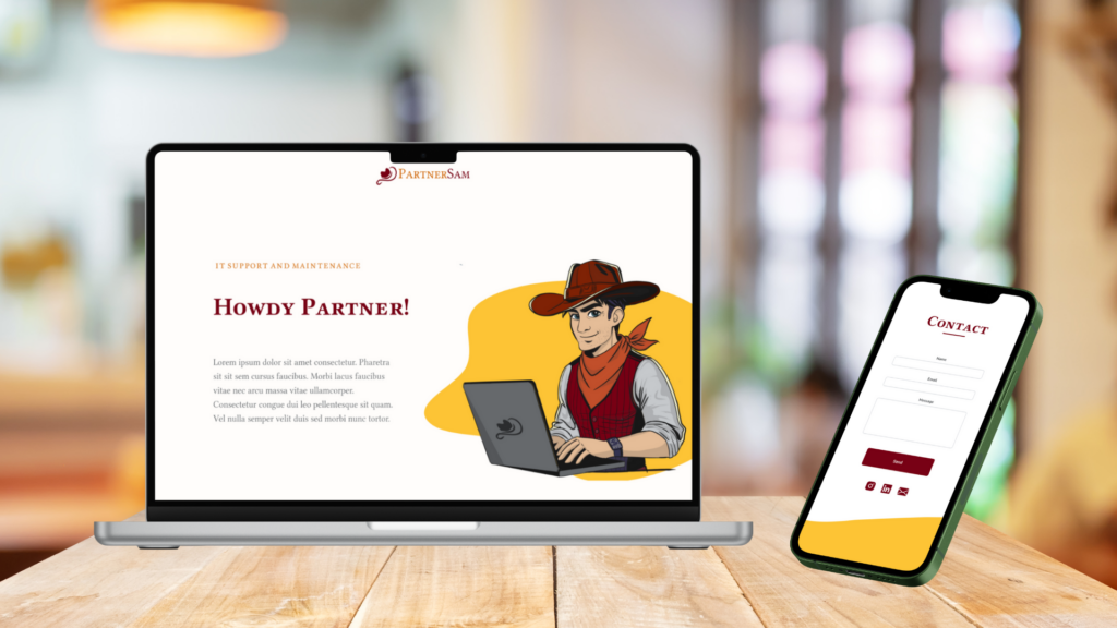
The mascot Sam embodies this universe with a touch of humour and approachability, reinforcing the human side of the service.

Sam is a modern cowboy, blending the figure of a Wild West sheriff with that of today’s digital partner.
He represents a trustworthy, approachable expert, always ready to act when challenges arise.
By reworking classic Western codes into a contemporary setting — where a laptop replaces the revolver — Sam turns technical expertise into the brand’s strongest asset.
He adds a human, storytelling-driven dimension to Partner Sam’s identity, making IT services more accessible, warmer and easier to understand, while strengthening brand memorability.

To facilitate integration and ensure consistency within the CMS, I built a set of reusable styles and a library of modular components.
Wild West colour palette (warm tones and strong contrasts), structured into primary, secondary, and neutral colours
Typography: one expressive display typeface for headings, paired with a highly readable text typeface
Grid & spacing: simple rules (margins, paddings, vertical rhythm) to maintain a stable and consistent layout
Element styles: headings, paragraphs, links, lists, highlighted blocks and dividers
States & interactions: hover, focus and active states, ensuring consistency across buttons and links
Hero section (headline, tagline, and CTA)
Service cards (icon or illustration, title and description)
Trust-building blocks (icons, key figures, short testimonials)
Accordion FAQ (improved readability and reduced cognitive load)
Banners / call-to-action sections (quick access to contact)
Illustrated sections (mascot + message) to humanize the content
Complete footer (contact details, links and legal information)
