Bien Dire is a visual identity redesign and UI design project for an astrology and well-being practice.
From art direction to WordPress website design, the project is built around a poetic illustrated universe, designed to combine clarity, storytelling, and emotion.
Art direction
Visual identity design
Illustration
UI design and website integration
The visual universe revolves around the heron, a totem animal embodying transformation and the balance between earth and sky.
Symbolism of heron:
Rebirth and renewal
Thoth, the first god of astrology in Ancient Egypt, was depicted as an ibis, a wading bird
His consort, Seshat, later became the “official” goddess of astrologers, architects — and even librarians
The Bien Dire color palette is rooted in a soft, luminous and accessible universe, reflecting the values of humanistic astrology.
Each color contributes to the project’s poetic language: blue suggests the clarity of the sky, yellow echoes the warmth of the sun, and pastel shades add a gentle, caring softness, in harmony with Bénédicte’s energy.

The typographic system of Bien Dire is built on a balance between symbolic elegance and modern readability.
It reflects the project’s duality: an approach that is both spiritual and accessible, grounded in softness and clarity.
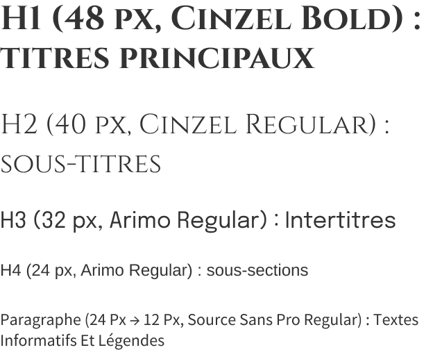
Cinzel – used for headings (H1 to H2)
→ Its classical style and refined capitals evoke the astrological universe and the symbolic dimension of the project.
Arimo – used for subheadings and section titles (H3 to H4)
→ More understated and contemporary, it brings a professional tone and a smooth reading flow.
Source Sans Pro – dedicated to body text and paragraphs
→ Modern, clear and highly readable, it reinforces the accessible and warm nature of the content.
These graphic elements support the website and social media visuals, contributing to a luminous and consistent visual atmosphere.
The heron plays a central role and was developed in several variations to suit different formats and uses.
Most of the graphic elements are custom, hand-drawn illustrations.
The existing website lacked clarity, visual harmony and smooth navigation.
It was therefore essential to address the following points:
Bring services to the forefront of the first screen through the “heron” cards
Provide direct and easy access to appointment booking
Simplify navigation with a clear and intuitive structure
Improve readability by giving more space to the text
Replace the existing colour palette with a cohesive pastel range
Integrate the heron, halos and celestial motifs throughout the website
Introduce a poetic and luminous dimension, aligned with the new visual identity
Remove interactions that were not suited to mobile use
Rethink margins, text sizes and spacing
Optimize the mobile first screen to provide an immediate overview of the offer
Switch to WordPress + Elementor to allow the client to easily edit her content
Plan the migration to her Infomaniak domain
Integrate backup and security systems

1. Faithful implementation of the mockups in WordPress using the Kadence theme and Elementor.
2. Responsive management – Manual optimization:
Removal of overly heavy backgrounds
Simplification of column layouts on mobile
Systematic centering of CTAs
Reduction of illustration file sizes
3. Dynamic content integration:
Creation of Services pages with direct links to Calendly
Instagram feed not integrated due to lack of access to the client’s account
4. Security and performance optimization:
Automatic backups via UpdraftPlus
Image compression
Cleanup of unnecessary CSS
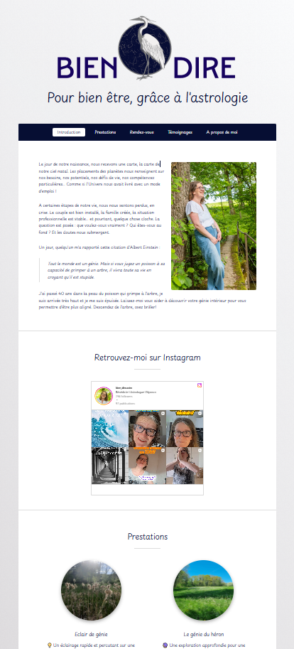
The final Bien Dire website delivers a soft, poetic and modern experience, in harmony with Bénédicte’s sensibility.
The homepage clearly highlights the key elements: services, client presentation, testimonials and the Instagram feed.
Navigation is smooth and intuitive, with direct access to appointments via Calendly links.
According to Egyptian mythology, Thoth, god of writing, knowledge and cosmic order, is depicted as an ibis — a wading bird closely related to the heron.
Seshat, goddess of writing, knowledge and architecture, is his feminine counterpart.
Together, they are associated with the origins of astrology and the transmission of knowledge.
The heron has always accompanied Bénédicte as a totem animal.
She sees it as a local reflection of the sacred ibis, a symbol of knowledge and guidance.
This symbolism perfectly aligns with her philosophy:

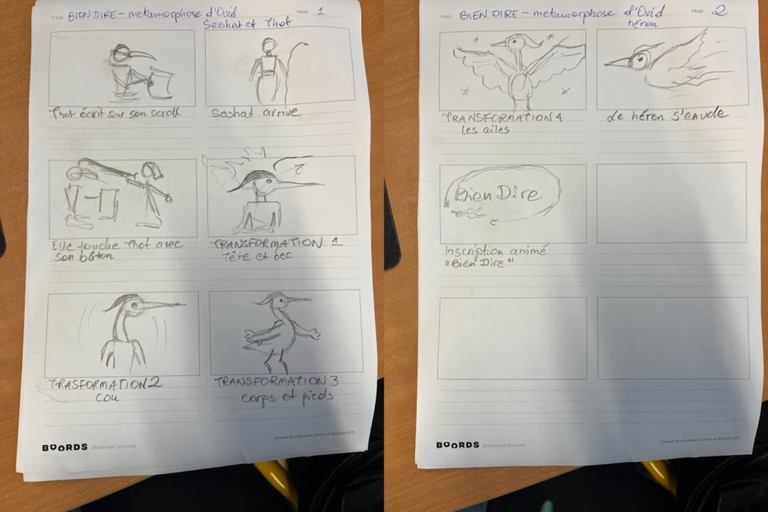
This storyboard was created partly on my lap and partly at the GRETA worktables.
Thoth appears, writing on his scroll — a symbol of knowledge and clarity.
Seshat enters the frame and gently touches him with her staff, initiating the transformation.
The metamorphosis unfolds as the character gradually becomes a heron.
Its wings spread, and the heron takes flight.
The video concludes with the animated reveal of the Bien Dire logo.